Thursday, May 31, 2012

Moonmachines at Cara & Co


You may have already read my post about my afternoon of MB&F Machine Madness. Well this is the second part of my MB&F Marathon Friday, otherwise known as 'Max Büsser eats half of Australia’s coat of arms'.

But more about that later.

I, along with half a dozen others, had been fortunate to have been invited by Purist friend Sidneyc to join Max for a private dinner held at Cara&Co, a restaurant situated at the back of a boutique which sells everything from clothing and accessories to books and cameras.

We were in the middle of Sydney in a Russian owned restaurant eating from a menu devised by a Belgium based chef to meet a Swiss who had just collaborated with a Finn on a watch.


Having not seen the latest MB&F collaboration with the wonderful Stepan Sarpaneva when I met Max a few hours ealier, I was looking forward to seeing whether my initial uncertain response to the Moonmachine in photographs would be maintained. My problem is that I am a Sarpaneva purist of a number of years standing, and I adore his moon in its natural habitat.Would I like it in a HM3 Frog?

But I digress. First up, the food.

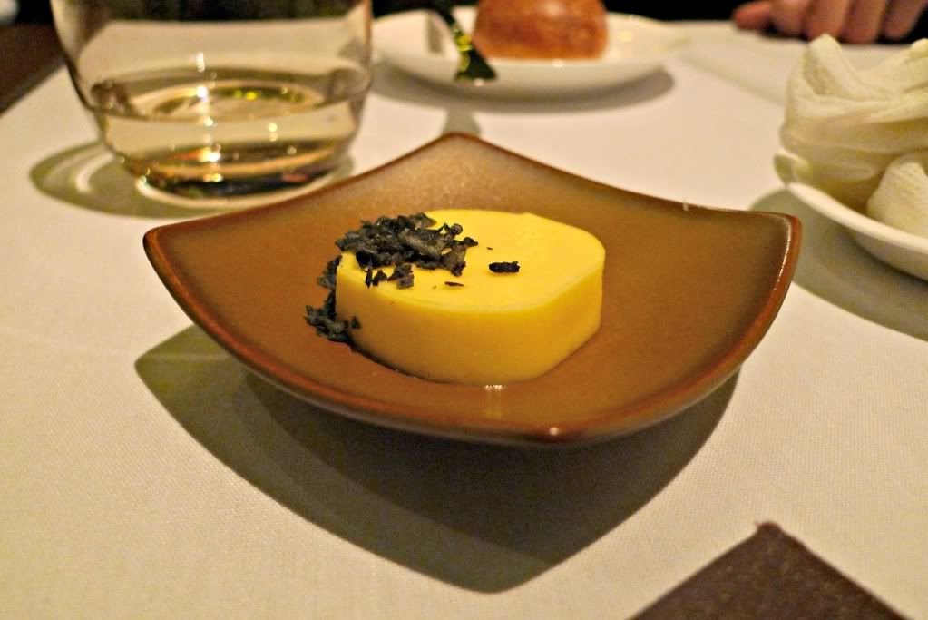
An amuse bouche to start : goats cheese (very mild) and mandarin lollipop


Plus some warm fresh bread rolls (which were constantly replenished) with some salted butter. Quite addictive bread and butter.


Max’s entrée of choice was ‘chicken oyster’.

Chicken Oyster - Chimay beer, potato, hazelnut, foie gras, coffee

What is ‘chicken oyster’?

They are the hidden-away sections of meat tucked under the chicken’s backbone. In this case, served in an oxtail jus with Chimay beer, topped with potato foam and, oddly, macadamia nuts with gold leaf.

My entrée was beef tartare, which was served with a 20 degree quail egg and a rather unexpected addition of some Avruga caviar. An unconventional tartare, but I really liked the saltiness of the caviar with the beef, and if beef tartare purists are aghast I’m sorry, but I really enjoyed this iteration.


Veal cheeks - Mustard, aioli, egg yolk, lettuce


For mains, Max had his first taste of national emblem, which I also ordered.


The kangaroo came two ways, including a cube of tartare with a parmesan marshmallow atop, black lentils, and artichoke cooked three ways - puree, baked and crisp. The meat looks rare but it wasn’t; and it was tender, yielding easily to my knife. I’d feared having a red meat overload, but this didn’t turn out to be the case.

Other mains were :

Rock Flathead with quinoa, cauliflower, silvered peanuts, peanut foam and gerkin juice


Australian wagyu rump with eggplant, miso, anchovy, baby carrot


Yellowfin tuna with tomato, cinnamon, white beans, watermelon


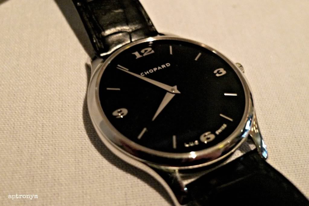
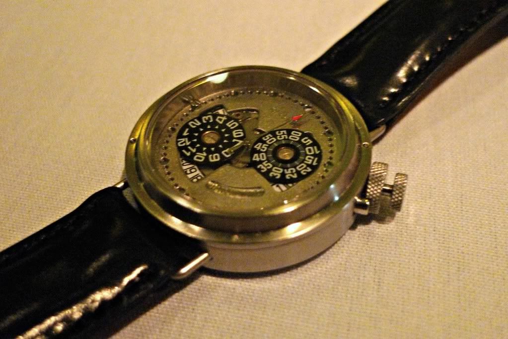
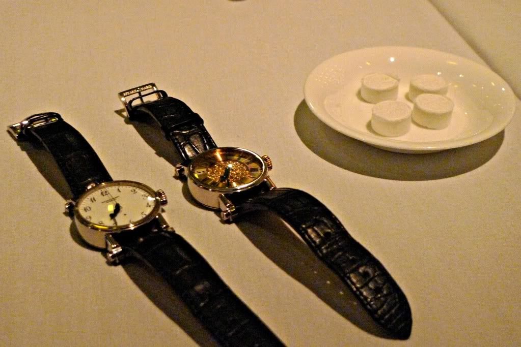
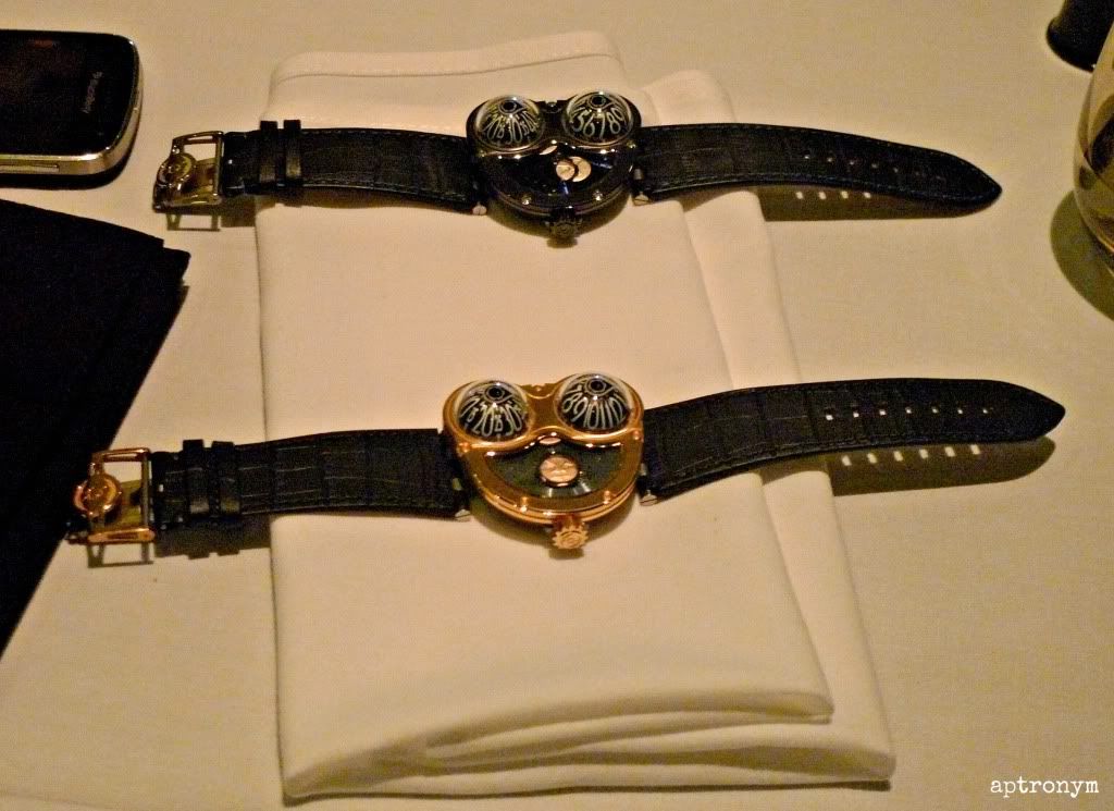
Accompanying side dishes were some random watches, including these :


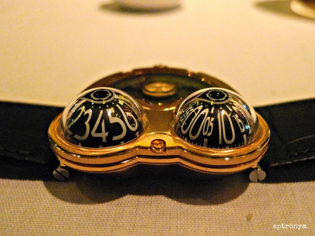
Finally, time for some Moonmachines. The reconfigured HM3 Frog now comes with Sarpaneva’s poignant moonphase seen through a Korona shaped opening, with the winding rotor actually a blued 22k gold disc with a laser-pierced northern constellation.


They are available in three limited editions of 18 pieces each: titanium case with white gold moon faces in a light blue sky, black titanium case with white gold moon faces in a dark blue sky and red gold case with red gold moon faces in an anthracite sky.


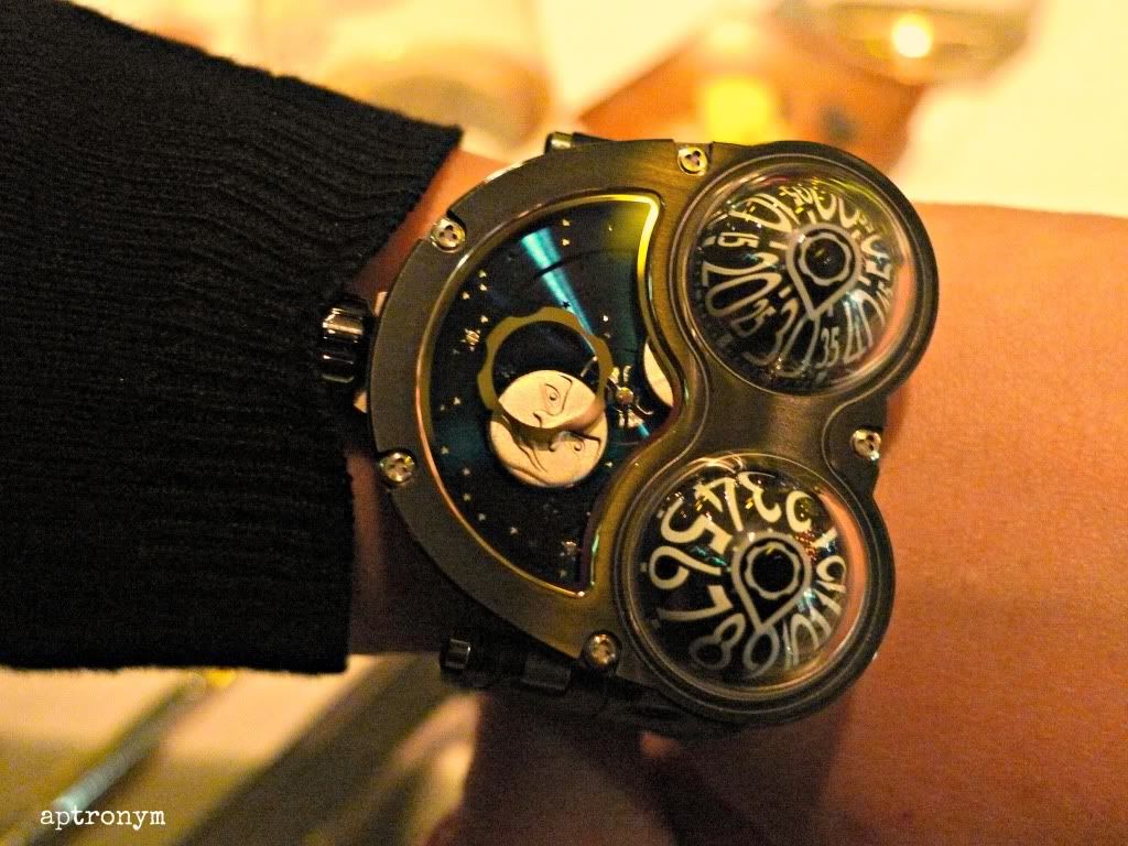
What did we think? That they were quite different in the metal. Far more appealing. Even someone who has held the thought that Stepan Sarpaneva’s moon is “too depressing” found himself drawn to the titanium version. 


Below is the titanium on my wrist. For a size comparison, see my previous post with my wristshots with other MB&F Machines.


During the evening we learnt not just about the Moonmachines, his friendship with Stepan, thoughts about the watch industry and his career trajectory, but also about his childhood, his family, his passion for car racing (we should take him out to a racetrack on his next visit), and even his foray into learning to play a guitar.


I know that I sound like an old record (and I realise that I am dating myself by even saying that) when I say that meeting independent watchmakers is an honour, but it is. They are the best people to communicate about their own watches, and it really is only by hearing them in such a small intimate setting that you properly understand what they are about, and why people are so drawn not just to the watch, but also to the watchmaker.

 Max finally gets to try Vegemite (photo credit : RJW)


Many thanks to sidneyc for his kind invitation to this wonderful evening.

In closing, two final photos for the road.

During the week prior to the Sydney dinner, the following happened to Gaz :

"So I get a call from a fellow Hong Kong watch collector. "Are you in Hong Kong and are you wearing your Sarpaneva? You have to come to dinner tonight with your Sarpaneva". So off I go to dinner with my Sarpaneva...


 ... only to find that I was hanging out with Max. Stepan was there in spirit and well represented by his merry men on the moon. Gaz"


[AP]

Cara&Co Restaurant on Urbanspoon


Sunday, May 27, 2012

MB&F Machine Madness


One of the really special parts of the watch world are the independent brands. Although they may not be as widely known in Australia as they should be, they have definitely had a profile here, largely through the active online presence of many Australian watch enthusiasts, some of whom also own 'Indies'.

One of the most well independents is Max Busser’s M&F. It is difficult to open a watch magazine or go to a watch related blog or website without reading about a Horological or Legacy Machine. This is a brand with some serious fans. I had never had an opportunity to see them 'in the metal', so it was with great pleasure and excitement that I accepted an invitation from The Hour Glass in Sydney, who have just become MB&F's newest authorised dealer, to spend some time with Max Busser and his watches.

I shall write more about meeting Max later; this first post is to give you a glimpse of six MB&F watches, and to share my thoughts about seeing them for the first time. With such unconventional designs, an important question will always be about wearability, so this will be my main focus.

These are the MB&F Machines with which I spent an interesting and glorious late afternoon interlude. The technical specifications of them can be found at MB&F’s website here :

Firstly, we have a family photo.

How much MB&F fun can one person have?


HM01 in White Gold and Ruthenium


Dimensions: length 41mm, width 64mm, height 14mm

With 376 parts, 7-day power reserve and an elevated central tourbillon, the Machine that started it all, the HM1, is a big watch. Max said to me that he designs all his watches for his wrist, they are intended to be worn. I am not sure how my wrist compares to the average female wrist, even with the glove on, but I don’t have a petite wrist, not a particularly large one. 


It sits large but reasonably comfortably and not too highly, which is good, but it’s probably designed to be worn a bit higher up the wrist area than I have it in this photo. It’s fun, and probably the most conservative, in retrospect, of all of MB&F’s creations to date.


HM02 in Black Ceramic and Red Gold – Ltd edition of 33


Dimensions (exclusive of crown and lugs): 59mm x 38mm x 13mm

There are 450 parts in this Machine, with instantaneous jumping hour, concentric retrograde minutes, retrograde date, bi-hemisphere moonphase.


This is, I believe, is the final one of these available for sale at any AD, so if you want to take a look at it, get in quick. Differently proportioned to the HM1, it is more sleek, more steampunk, but still long in terms of wrist real estate. It's very striking contrast of colour and texture, and I am particularly taken with the ‘matte-ness’ of ceramic component. 


HM03 Sidewinder in White Gold and Titanium


Dimensions (exclusive of crown and lugs): 47mm x 50mm x 16mm

This is one half of a famous duo. The 'Sidewinder' has the cones lined perpendicular to the arm, and 'Starcruiser' has the cones in line with the arm. With hour and day/ night indicator on one cone, minutes on the second cone and date around the movement, this Machine is all about being able to see inside it. When it came out, everyone seemed to be debating whether they preferred the Sidewinder or Starcruiser, but I’d just been thinking about how big they looked.


As it turns out yes they are large, but they actually not only sit pretty comfortably, including on a woman’s wrist (see photo), but they do not look as large as you’d think. I was much more taken with this than I had anticipated I would be. It had quite a different impact on me ‘in the metal’, the whimsy shone through in a way that is not possible when you’re just looking at photos.

(thank you to my wrist model, whose wrist is a bit smaller than mine).


HM04 Thunderbolt in Titanium


Dimensions: 54mm wide x 52mm long x 24mm high

With 311 parts, this aviation-inspired Horological Machine features hours and minutes (right dial) and a power reserve indicator (left dial) with separate crowns for time setting and winding. 


When seen in real life, the impact (not to mention the watch) is definitely high, and it was only in being able to see it that the talk about it having its genesis in Max Büsser's childhood passion for model plane kits made sense. This is a watch you want to take off and play around with.


It’s a very visceral watch, the HM4, and sweetly plane-nerdy. 


It’s great fun to play with, but of all the MB&F Machines I saw, this was the only one that was difficult for me personally to contemplate, though I’ve seen a photo of it on a friend’s (male) wrist and it looked fine. It carries a bit more heft and sits a lot higher than I had expected that it would, but it also seemed to be heavier than the others. 


Legacy Machine no 1 – red gold and white gold


Ah my domed beauties …. I never thought I’d have the pleasure of your company.

"What would have happened if I had been born in 1867 instead of 1967? In the early 1900s the first wristwatches appear and I would want to create three-dimensional machines for the wrist, but there are no Grendizers, Star Wars or fighter jets for my inspiration. But I do have pocket watches, the Eiffel Tower and Jules Verne, so what might my 1911 machine look like? It has to be round and it has to be three-dimensional: Legacy Machine N°1 was my answer."  Maximilian Büsser


Appearing to be the most ‘conservative’ of MB&F’s machine creations, it is in fact not conservative at all, with a wonderful marriage of splendid classicism with a edge of an almost industrial modernity.


At a comfortably (and almost small) 44mm with a unique vertical power reserve of 45 hours, it features completely independent dual time zones displayed on two dials. The left crown at 8 o'clock is for setting the time on the left dial, the right crown at 4 o'clock is for setting time of right dial and for winding.


Available in 18k red gold or 18k white gold, my heart belongs to the white gold version. The red gold version bears the warmth associated with that metal, but the clean sharp sleekness of the white gold seems more modern.


Oh and I’m clearly not alone in being enamoured of the LM1 – there is a worldwide waiting list already …


Many thanks to Ching and The Hour Glass for the opportunity to see these watches. As well as being a lot of fun, it made me realise that Max was right when he said that he designed them to be wearable – they actually are. 

Oh and just in case you're wondering about the sizing issue, some 20 odd percent of MB&F owners are women.


[AP]


Thursday, May 24, 2012

The Rolex Ref. 5513 Mk IV


Having already blogged about the Ref. 5510 and the Double Red Sea-Dweller (Ref. 1665), today’s classic Rolex is the Ref. 5513 Mark IV. To read about the beginnings of the Rolex Submariners, go to the Ref. 5510 link above, but as was mentioned there by TonyC the 5510, which had a short production run (est. third-quarter of 1958 until late 1960), was replaced by a larger cased 5512/ 5513 (COSC/ non-COSC). 


The 5512 and 5513 were both fitted with the oversized crown which became a standard feature of the Submariner line, and came initially with a pointed crown guard, but later changed to the more rounded crown guard. Sometime in the early 1960s, Rolex discontinued the use of radium paint for the indices, switching to the safer Tritium. 


The 5513 was produced from 1962 through until approximately June 1990. It used Calibres 1520 and 1530, and the latter appeared in both the 5513 and 5512 for a time. Early dials from the 5512 and 5513 had what is called a ‘gilt’ dial, referring to the fact that the colour of the text was gold. Around 1965 or 1966 Rolex discontinued the use of gilt dials on the Submariner watches and switched to white printing. 


This is 5513 MK IV ‘maxi dial’ with a 7.9mil serial, from about 1983. The bezel is sharp, the dial and indices in remarkable condition.

What is a ‘maxi dial’? Well the term was first used by Rolex at Baselworld 2003 to describe the larger luminous dots on the Reference 16610LV. It was then appropriated retrospectively by vintage Rolex collectors for vintage Royal Navy Submariners, and then taken back even further, chronologically, to refer to older Submariner models. A close examination shows that the post-1975 maxi dials share two characteristics: larger lume dots and generally bolder text, especially for the depth rating and 'Submariner'. 


The Type IV shown in these photos is the second-to-last known style of matte dial for the 551x reference, showing up on Subs with high 6 million case serials until around about the late 7 millions. 

Even if you're not an old-school Rolex fan, you have to admit that this is in pretty damn good condition, and a classic versatile watch.

So … have we turned you into a possible vintage Rolex sports watch enthusiast yet? 


[AP - with thanks to TonyC and initialjh]

Sunday, May 20, 2012

Christiaan van der Klaauw Aquarius Planetarium


In an extravagant and bold segue from his Planetarium watch, touted as the world’s smallest functioning planetarium, Dutch watchmaker Christiaan Van Der Klaauw has combined with master-engraver Kees Engelbarts for a mashup of astrology with astronomy, resulting in the first of twelve pièce unique, the Aquarius Planetarium.

Based on the Planetarium, but really not resembling it at all, the Aquarius’ dial is dominated by an amazingly intricate depiction of this astrological sign in white gold. At 12 o’clock is the well-known planetarium, showing the cycles around the sun of the revolving Mercury, Venus, Earth, Mars, Jupiter and Saturn.

On the outer most ring of the planetarium are the astrological positions marked in black on a metallic finish base. At 5 o’clock is a matte finished sub dial identifying the month and the position of the sun. The time (hours, minutes, seconds) hands are carry on the matte theme, which means that they blend somewhat into the engraving work.


The 40mm platinum case has an open case back which reveals the 18k rotor hand-engraved by Jochen Benzinger. Each of the watches in the series will use the automatic CK1196 calibre movement with a built in planetarium module.

In total, there will be twelve of these timepieces, one for each zodiac sign. They come at a hefty €79,500 each (including taxes, if that makes a difference for you), and the remaining eleven will be made to order.  Will all twelve be ordered? It wouldn’t surprise me if they were.

Oh, and if you’re wondering about the price of the ‘regular’ Planetarium, the current list price for the KPT1126 model is € 31.500.


[AP]