Friday, July 23, 2021

TAG Heuer x Super Mario

Super Mario Brothers holds a special place in my heart. I have very fond memories of when I was around 7-8 years old, going to my cousin’s place to play the game. It might seem like a little thing but it was something I’d always looked forward to. 


I’m not ashamed to say I have the character soft toys. The lego Mario. The tee shirts etc etc. The whole nostalgic money grab works just a little too well on me. It really is a case of "shut up and take my money". In this case, when I saw the teasers I was hooked. I do like TAG Here watches. Not the entry level quartz stuff mind you, but I understand that it's a business and it's bread and butter stuff. However, even if they put Mario on the entry level Formula 1 automatic chrono with the ETA7750/Sellita SW500 for 5 grand I would've put my money down. Seriously.


This announcement was really exciting. Even though deep down I knew it would be the Connected Watch, but I was hopeful that they wouldn't be so predictable and pair Mario with a mechanical chronograph. I could even use it to time my Super Mario Bros speed runs. (not that I’d actually do it, but hey, it’s the possibility that counts right?)


So hopeful was I that signing up to be notified of availability from TAG Heuer was immediate...  too bad the response was anything but. Seems like someone somewhere dropped the ball a bit and I never received the notification and looks like I wasn't the only one. And now it's sold out. Was I surprised that it sold out? Not one bit.  It's a clever strategy to shift units quickly and at least bring attention to the product line. 


What would I have done with the partnership? I’d use the Carrera case, but with the Caliber 16 movement (ETA7750/Sellita SW500) to  keep the costs down a little. Have a brick coloured rubber strap with the bricks motive and put the mushroom and star at either end. Use the green pipe as the watch box. These are no brainers. You could substitute the small running seconds hand with a star so it’s always spinning. Or even the spinning fireball from Bowser’s castle. The watch designs itself! Come on Nintendo and Tag! These are free design inputs. Feel free to use them. And send me the revised final product. Email me for the shipping address :P 


Romain Jerome Super Mario watch

I’m pretty sure there will be more products coming. But for now, hands down the best collab between a watch brand and Super Mario Bros so far would be the Romain Jerome…


Tuesday, May 25, 2021

IWC - Pilot's Chronograph AMG Edition

 pilot

/ˈpʌɪlət/


Noun

  • A person who operates the flying controls of an aircraft.


By this definition, one would think that a pilot’s watch means a watch for the person who operates or flies an aircraft. Of course, by the same definition, a diver’s watch should be for someone who “dives”. 


However, as we all know, watches designed for a specific purpose or style no longer applies to the wearer these days. Therefore, one could say that the design philosophy could also be freed up, and no longer bound by the name of the watch. What am I getting at you ask?


Let’s have a look at the just-launched IWC Pilot’s Chronograph AMG edition. It is the first IWC Pilot’s Watch to be produced in titanium, and features racing-inspired styling cues such as the carbon fibre dial, the carbon fibre look strap and of course, the lightweight titanium case. This is not the first AMG collaboration. The very first IWC AMG watch was based on the Ingenieur (German for engineer) and it was also in titanium, with an in-house time only version as well as ETA 7750 based chronograph.


If you ask me, the Ingenieur collection is a much better fit to AMG - because their whole rasion d’être is about improving the engine and performance of Mercedes-Benz cars, and each engine is built by a single engineer whose signature is on the engine cover. So why is the latest collab a Pilot’s Watch?


Personally I think it was a mistake to have moved the design of the Ingenieur away from the Genta-esque to the vintage '50s look, especially given how popular the “non-round sports watch with integrated bracelet” theme is these days. It’s almost as if they had no choice but to stick it on the Pilot’s Watch as 1) it’s a best selling range for IWC and 2) they won’t sell any if they based it on the current Ingenieur (Yes I know they did one for the 50th anniversary of AMG back in 2017) plus 3) the vintage style isn’t a great fit for AMG with its modern, high performance values (and I stand by my opinion on this).


To be honest AMG feels like they’ve sold out and gone a little too commercial as well. Don’t get me wrong, an AMG C63 is still at the top of my car shopping list and the AMG GT is firmly in the “grail” segment but like IWC they’re sticking pretty much the same engine in everything from A class to X class (yes I know it doesn’t exist but I’m sure they would’ve if they could’ve). So in that sense there is some sort of commonality in rationale.


Back to the watch - it’s a conservative and safe approach. It’s a known quantity, has broad appeal, and almost guaranteed success. But is it appropriate? I’ll direct that question to those who wear a diver’s watch matched to a suit, where the only action the watch sees is the water from the running tap…


(Before someone points out to me that in French, a “pilote” also means driver, as in a car/racing car driver, and therefore in this sense the pilot watch works. You try explaining that to the general public, and why a German-speaking brand would use the French definition, and also Zenith tried this with their pilots range before with a forced motorbike connection. It really doesn’t work…) 


So IWC, if you’re reading this, can you please bring back the Genta style Ingenieur?

Friday, January 22, 2021

Hands On: Zenith Chronomaster Sport - LVMH Watch Week 2021

 The current Zenith Chronomaster range, formerly known as the El Primero range, has been a best seller for almost a decade, and almost unchanged. The classic, original 38mm size as well as the larger modern (at the time) 42mm were a mainstay and a consistent performer. It’s an icon of Zenith, with a distinctive at-a-glance tri-colour oversized sub dials and of course, the high beat of 36,000 VPH of the movement. It’s a style that has been around since the very first El Primero equipped model named A386 back in  1969, and as the saying goes, if it ain’t broke...


So why kill off such an iconic, much-loved classic watch? Rolex does ok making the same thing decade on decade. Subtle changes here and there, but the overall look and feel is almost the same. Omega Speedmaster hasn’t changed all that much either since 1957. These are definite examples of enduring classics, with only very minute detail updates. There are of course view points that one shouldn’t tamper with a classic, and others, who feel that if something remains the same it can become quite stale.


Design Evolution of the Chronomaster: 1969 A386, the 42mm version, the Chronomaster 2 from 2019


What if there’s a way to keep the iconic look, but freshen it up at the same time? What if, by combining a few icons from the past catalogue and in turn, bring about something that is both a nod to the past, but set to become a future icon in its own 

right? What if it’s possible to take an iconic product and make it even  more iconic and distinctive? Well, ladies and gents, wonder no more. Presenting, the new Zenith Chronomaster... SPORT.


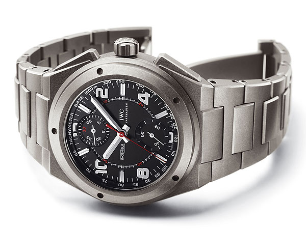
At first glimpse, it is still distinctively identifiable as a Zenith, with the 3 (slightly) overlapping colour sub dials. Yes, the date window is still at 4:30. Ok, fine... With a second look, you see the pump pushers and the case shape and the chamfer of the edges remain. On closer inspection, the bezel might be reminiscent of the De Luca II, updated to the oh-so-21st century material of ceramic, but... something’s different. It’s not a tachymetre like it used to be. The markers, the numbers, the scale... wait... these are completely foreign... There’s nothing like it at all... what does it do?? Once you start the chronograph by pressing the pusher at 2:00, feel the crispness that only comes with a column wheel set up, and everything  becomes clear.


Watch the central chronograph seconds tick and the first thing you notice is that it’s a lot faster than you’re used to. In fact it’s 6 times faster, by doing a full revolution in 10 seconds. Now the scale on the bezel makes sense. It’s a simple and clear indication of one tenth of a second, something that can only be done due to the high beat of 36,000 vibrations per hour (10 beats per second).


This 1/10th of a second indication is made possible by an updated/upgraded/evolution of the El Primero movement, with a longer power reserve of 60 hours, and hacking seconds. In doing so they’ve unfortunately removed a quirk, which is the “back to front” time setting position of the crown. It is now the normal way around with date at position 1 and time change at position 2.


What about the rest of the watch? The case diametre is an immensely wearable 40.5mm, and with shortened lugs, the approx lug-to-lug of 46-7mm, meaning it will fit a lot more wrists as well as offering a better fit. The Chronomaster used to only really sell on a leather strap, but now, the bracelet is perfectly suited to the watch, and you still of course have the option of fitting a leather strap to it if you so wish. Overall watch is very well balanced, sits comfortably and to be quite honest, this could very well be an “only” watch, such is its versatility.


There are two dial options at launch, a clean white base dial, and the black lacquered dial which, matches the ceramic bezel perfectly. The white offers a brilliant contrast, especially with the black lacquer-filled indices and quite possibly, the better option to match with various different colour straps. The sub dials are layered, giving a bit of depth, and features circular guilloche. There is some lume but nothing compared to Zenith’s own Pilot type 20.


Own strap fitted. The white dial will come with a blue cordura style strap


The bracelet is meant to be inspired by the Gay Frere's ladder bracelet, but it's really an updated 3-link Chronomaster bracelet, polished centre links, and now with chamfered edges as well to match the case. The clasp has been changed to a more common single folding clasp with a locking mechanism and micro adjustments.


So the all important question: How does it wear on the wrist? Quite simply, one of the most comfortable watches I have ever worn. The size and proportions are perfect for me. The weight is just right. It can easily go with jeans or with a suit. Dial is highly legible. It feels like your favourite pair of worn in jeans that you’d be happy to live with daily, but it feels that way fresh from the box. Regardless of what you think of “sizing” I would strongly recommend putting it on the wrist first.


Overall, I think Zenith is on to a winner. It’s classically designed, with enough iconic features to make it distinctive; acknowledging the past whilst moving with the times. It is a lot of watch for the money and stacks up very well against its closest competitors. Will it gain the icon status? Only time will tell, but I have a good feeling about this.


The King is Dead. Long Live the King!


Zenith Chronomaster Sport


Reference: 03.3100.3600/69.M3100 White dial on bracelet

Reference: 03.3100.3600/21.M3100 Black dial on bracelet


Diametre: 40.5mm stainless steel case

Lug to lug: 47mm

Case height: 13mm

Water resistant: 100m

Power Reserve: 60 hours

Movement: Cal 3600, 36,000VPH automatic chronograph movement showing 1/10th of a second


Australian RRP: $14,300 on bracelet, $13,600 on strap


Available now:


Swiss Concept

Monards

The Hour Glass

Gregory Jewellers

Barbagallo Watch

Tuesday, January 12, 2021

NanoBlocks Vs Petit Blocks: The Block Comparo You Didn't Know You Needed Until Now

Look before we even begin, I am firmly in the Lego camp, having been brainwashed and brought up on it since I was a wee lil lad, but Legos are also expensive. And space consuming. And when space is at a premium, you downsize. Right? Mini doesn’t quite cut the mustard. You need to size down further... until you reach the nano stage! 


To be quite honest I only very lightly dabbled in Nanoblocks, partly due to its basic, blocky nature which can make certain object look cute, in a very low-res sort of way, but these tiny blocks ain’t cheap cheap either. A smallish, basic set will set you back $13 dollar bucks, and the bigger sets, well... 


They also lack the “clutch power” that Lego offers, meaning they can be quite flimsy, and at their size, if you accidentally break something and the pieces fly off, you’re not likely to see them again. Hence the generous amount of spare pieces included with each set. 

It wasn’t until the kids and I saw these Daiso “Petit Block” that piqued our interest. They looked exactly like Nanoblock, and at $2.80 a pack, who cares if they turn out to be rubbish? It was worth a punt. And punt we did. (It was also the school holidays so I was desperate for anything that might occupy them a while so I could have some peace and quiet.)

Imagine my surprise when they turned out to be a lot better than I’d hoped. The blocks fit very tight, which to young hands can be quite difficult to fit, but once fitted they don’t fall apart as easily as... With the initial impression being so positive, we then decided to invest more. But, how much alike are they? Obviously the Petit Block is the most sincere form of Nanoblock flattery, there are some subtle differences. I just happened to have the flamingo in both version, so a comparison is a must. 


These are two distinct interpretations of the flamingo, with the pose better on the Nanoblock and the colours slightly more realistic on the Petit block. Nano also uses round blocks for the neck, and has a sleeker overall design. The Petit Block though, having both legs firmly attached to the "water" is less likely to come part. Something else you don't notice until comparing the two side by side is the fact that the Petit Block is very slightly bigger than Nanoblock, so the two systems are unfortunately, incompatible.

NanoBlock Flamingo - AUD$12.99

Overall, straight out of the bag, the designs of the Petit Block leaves much to to be desired but this is the thing about blocks. You can change it. Make it look better, or have a better stance. You are only limited by your imagination. No need to follow the instructions if you feel like you can do a better job. And therein lies the rub. At $2.80 a packet you could buy multiples and let your imagination run wild in the world of 8-bit-esque 3D block party, without feeling the pinch. Your wallet and your sanity will thank you.  Whereas with Nanoblock, you feel obliged to build what is offered and instructed, and because it’s so flimsy, you are half tempted to just glue the whole thing and leave it on display.  

Daiso Petit Block -Flamingo AUD$2.80

Ultimately it comes down to you and what you want to build. Petit Block is inexpensive but it is the more limiting in terms of range of colours, choice and types of blocks. However, there are enough options and definitely a great way for anyone to be creative on a tight space and monetary budget.

Monday, January 4, 2021

The Sydney Tarts Top 10 Sneakers for 2020

2020 has been an interesting year for me in terms of sneakers. It went from a year when I was suppose to go through a period of consolidation (due to lack of storage space…) to a year of… let’s just blame it on the ‘rona shall we? I went a bit nuts and any semblance of self control went out the door (when we were stuck indoors…) The sensible part of me feels that any sneaker that didn’t make my top 10, i really should off load right? But that’s something else for another day perhaps. 

I suppose 2020 for me could be classified into 2 categories of sneakers - retros and collabs. Retros are self-explanatory and it’s not new. Collabs? To be honest I cannot be arsed to chase nor am I comfortable paying silly prices for the hottest and overhyped ones, but there are plenty of other interesting designs that for one reason or another aren’t as sought after and as a result, you can them up without a second mortgage. 


Here we go with the top 10 pick-ups for 2020, in no particular order.


1. Reebok Shaqnosis


The first pick-up for 2020 makes the list because it pulls at the nostalgic strings - The Reebok Shaqnosis was polarisingly styled, and yet so distinctive it became a classic almost immediately. I was a fan of Shaq back in the days, and my absolute favourite Shaq signature sneaker has to be the Reebok Shaq Attaq, but it did take a while for me to warm up to the Shaqnosis. It’s not something you would just put on and go out, and it’s definitely not something I would wear on court anymore. I was very indecisive on it the last time it retroed but there was no hesitation this time ‘round. It’s not something for everyday wear of course, but it definitely brings back fond memories of my youth and a time when basketball was a big part of my life, (and also a time when we couldn’t afford any of the big name sneakers, so making up for it now…)


2. Nike x Undercover Daybreak 


This was a collaboration that was firmly in the shadow of the other, much more hyped but similarly executed one of the Sacai Vapor Waffle. Now before you all start to comment about how different they are, let me be clear this is my way of comforting myself for not being able to afford the Sacai collab. To be honest I’m just as happy with this as it can be had at a huge discount, and one I’ve worn number of times this year.


3. Nike LeBron x James Elliot Icon QS


Would this count as a triple collab? I believe the first drop of these sold out really quickly but for some reason the second drop with fresh colorways just sat? Was it a matter of overestimating the demand and thus over-saturating the market? Not that it matters to me as I was able to pick these up for a song. For some reason the full length air isn’t as soft as I remember given it’s the same tooling as the regular LeBrons 7-8. But maybe it’s because I’ve not broken them in properly yet.


4. Adidas x Alexander Wang Bball Soccer 


This is a collab upon collab sneaker this one. Adidas x Alexander Wang as well as Basketball x Soccer. It’s the definition of hybrid! Even the outsole is a hybrid of boost and…whatever the other stuff is. But the sneakers are surprisingly comfortable, the quality is top notch, and being less dramatic as some of his other works, it’s actually more timeless and easier to match.


5. Nike Air Max 2 CB34


Let’s move away from collabs and get back to retros for a bit. Jordan retros went nuts this year, and people tell me it’s due to the documentary “The Last Dance” which got people interested in Air Jordans again and as everyone was locked down, might as well buy the sneakers as a form of escape? This meant other historically significant retros sat on the shelves long enough for me to pick up at retail. This was one of the more iconic sneakers for me personally and it’s something I’ve always wanted to have, even though with all the max air it still feels like a brick. So no, definitely won’t be playing in these. Not even an everyday sneaker, given it’s a bit tough to get in and out of, but this is the price for nostalgia.


6. Y-3 BYW S97


I went through a bit of an Y-3 phase this year. I do like some of the less outlandish designs from Yohji Yamamoto, and even though the retail pricing is very high for what you get, almost all the styles go on sale (minus some of the more popular styles, but then I can do without them). When they are on sale, they’re decent value for money, and the favourite out of all the Y-3 this year would have to be the BYW S97. It strikes a good balance between classic, subtle design, with comfort and brand name… 


7. Converse Chuck Taylor CX Disrupt


Chuck Taylors are probably the longest serving retro sneaker range currently available, and every once in a while Converse mixes it up and do something interesting based on the classic silhouette. Now I have nothing against Chucks, and I have owned several pairs in the past, but there are more interesting stuff out there. So apart from the occasional limited editions, they don’t really hold my interest until now. This was something very different; a modern, yet retro futuristic design, at the same time addressing two of my biggest gripes about the Chucks - they’ve made it much easier to put on (ie without the need to untie and retie the laces) and comfort. Yes I know they’ve had the Chuck 2s where they experimented with lunarlon insole that didn’t seem to sell, which was bewildering to me, and the Chuck 70s which I admit, are comfortable. But whatever the formula for the CX foam is works great for me. It’s supportive and compliant without being to overtly bouncy or squishy. Oh, and the stretch canvas? a godsend!! Makes it so much easier to put on and take off. This was definitely something that has been missing. Easily one of my favourites for this year and it has seen plenty of wear. 


8. Adidas Streetball


This was a very pleasant surprise. I’ve liked the look of it, but a lot of the colour combos had been a bit too colourful for me. But when these popped up with further discount off sale prices, it was a no brainer. And that they’re comfortable to boot is a bonus. Despite its name, I won’t be playing street ball in these though, as there is no lockdown to speak of. Casual wear however, is perfectly fine.


9. Converse Chuck Taylor Bugs Bunny 80th Anniversary Limited Edition


Quite possibly the only pair of sneakers this year that I probably won’t wear. Bugs Bunny was a part of my afternoon after school. Along with Sophie Lee. Ahem. To be honest, right now, anything that is nostalgic for me is pretty much a “shut up and take my money” prospect. I especially like that Bug’s cheeky personality comes through on the sneakers. Much like the Homer Simpsons Chuck Taylor I have from a few years back - these will most likely remain a pair of “collection/display” sneakers.


10. Air Jordan 3 Denim


This was an unexpected find actually. I was on lunch break one day and decided to pop into the George Street Footlocker to have a look, given I haven’t been in for a while. I saw someone else was trying on a pair of the Jordan 3 Denims. I thought they’d all sold out on release, so I tried my luck and asked the staff whether they had any left in my size. He went out back and brought out the last pair they had. My size! Given how difficult retro Jordans were to come by these days, and to be able to get a classic one with pretty decent colour blocking, AND at a discount for being a member, well… I couldn’t say no…


There are a few late additions for 2020 (December 31st to be exact) which will still count towards 2020 pick-ups, except I won’t take delivery for at least another week or so. Why such a splurge right on the last day? Because I am going to try and be disciplined and do this year what I was supposed to do in 2020, which was to consolidate, and so a literal last minute splurge before the self-imposed disciplinary action… But I will do a review on them once I receive them, and I’m cautiously optimistic that they won’t be disappointing (unlike a number of pairs this year).

Wednesday, November 18, 2020

Quick Look: Seiko Prospex Shogun SPB189J1

If I were to choose a click-baity kind of title this would have been something like, “You would be shocked at the price of this Seiko!” but this is not that kind of a website, and as much as I would like to just poke fun and use that title, I won’t.

I came across images of this new release and I was intrigued. It looked fantastic! As a fan and owner of numerous Seiko pieces I thought this was another piece I wouldn’t hesitate to add to the collection. It hits all the marks for me… until I saw the price.

Seiko Prospex SPB189J1

Now it is true and for those who known me well, knows that I am a sucker for nostalgia and I do tend to dwell in the past more than I do in the present… Yes I’m one of those that talks about the good ol’ days (well that goes for all you Rolex-heads as well. You know who you are.) When I first began in retail in the industry, almost 2 decades ago, an Omega Seamaster Professional 300m automatic (better known as the Bond watch) went for RRP of $3100 Aussie dollarbucks. The most expensive Seiko we had in the store was a $750 Seiko kinetic perpetual of sorts (not the funky one with the 4 separate dials.) That watch sat because the vast majority of the Seikos sold in the store was around $150-$200.

My Seiko Prospex Shogun Zimbe Limited Edtion.

How times have changed.   

What’s the point? I’m getting to it. 

The watch in question is the updated Seiko Shogun (Reference SPB189J1 – remember Seiko doesn’t deal in nicknames. The enthusiasts christen watches with names but… officially…) This seems like the same case and bracelet as the previous generations, with an updated movement and longer power reserve, new dial and hands. Oh, and a big fuss made about the matched date disc colour.

I really like the look. I think the refined hands matches the new triangular indices, and the case is nicely designed and produced. It has gone from a Rolex-esque styling to having an identity of its own. A definitely improvement but I can’t help feel that it might be a little too similar to its sibling now - the “Samurai”. The bracelet still looks and feels like it belongs more on a $100 watch than something with 4 figures, but I guess you are paying for the titanium, the hard coating and the finishing on the case. Judging from the images it certainly won’t look out of place next to a Seamaster or a Tudor. Now if only they would put a bit more effort into the bracelet…

Long gone are the days when the Shogun could be had for around $1000 (before the re-branding to become part of the Prospex line) and even then, one could be had for around $1500, but at that price point it really was only for the Seiko enthusiasts and not the general public. However, credit where it’s due – Seiko has done wonders moving the brand image up the price point. And whether or not you feel it is justified, it’s where they are now positioning the brand.

Seiko SBDC007 - the OG Shogun, with the cursive "Automatic" text and SCUBA at 6:00

Head over to Fratello Watches for some really fantastic pics of the watch. Unless of course, Seiko Australia, you're willing to send me one for some more lifestyle photoshoots? 

Seiko Prospex SPB189J1
RRP: 1550 Euro (Approx $2500 AUD)
Case: Titanium 42mm diameter, 13.3mm height, titanium bracelet
Movement: 6R35, 70 hours power reserve
Water Resistance 200m

Wednesday, November 11, 2020

On The Wrist: Zenith Chronomaster 42mm Blue Dial

We all know that the tri-colour subdial Zenith Chronomaster with the silvery base dial is a modern classic, with only slight alterations to the case and dial over the past 50-odd years. The classic look, however, may not be for everyone. Just like not everyone wants the classic Speedy moonwatch (gasp horror). 

The blue dial version of the Chronomaster was launched in 2016, alongside the dark grey version as well as a “classic car” version, with vertical Geneva stripe finishing on the slate grey dial, mimicking the finishing on car engines. These were an attempt to offer some variations on the theme and to offer alternatives. Did you know, however, that there were actually multiple dial versions of this watch?


Now it never ceases to amaze me just how Rolex is able to garner headlines and in-depth articles out of mere changes in millimetres. I mean, surely there are more important things, even in the watch world, to talk about? Another thing that really gets the the discussion going are the subtle differences in dials/date fonts/text sizes/lines of text/colours of text etc, and each can be discussed in so much detail they almost warrant a thesis. Not to mention the sort of effect on the resale value. So what are the versions exactly?

Version 1: This has the red 36,000VPH line of text underneath Zenith and El Primero at the 12:00 position. Rumour has it that the red text only ever appeared on the prototypes, but there have been a handful spotted out in the wild, meaning there must have been pieces in this configuration that were sold through to retail stores. How rare is it? Who knows? There are no numbers provided and I doubt Zenith will ever provide the numbers.

Version 1: Red 36,000Vph text at 12:00. 6:00 sub dial over 9:00 and 3:00 counters


Version 2: This one goes without the red 36,000VPH text on the dial and has the “wrong” configuration of the 12-hour counter overlapping the running seconds and the minute counter at 9:00 and 3:00 positions respectively. Believed to be produced only for around a year (mid-2016 to mid-2017) before the next version came along.

Version 2: 12: sub dial over the 9:00 and 3:00 sub dials, no 36,000Vph text

Version 3: Final version with the “corrected” dial layout – 9:00 and 3:00 subdials overlapping the 6:00 subdial – thus makes it easier to read the markers for the minute counter (rather than having several minutes obscured). This version was produced from mid-2017 until mid-2019, when the “coloured” models of the Chronomaster range were phased out.


Version 3: 6:00 sub dial is under the 3:00 and 9:00 subdials (image from the Zenith Watch Forum FB Group)
 

There are still a few of these pieces hanging about at dealers, so have a good close look at the versions using this article as a guide. You never know when you might stumble upon the single red, which I reckon will have the potential to be as sought after as the Rolex double red.

But there’s more…

There is apparently another version with the word “automatic” printed in the 6:00 subdial. I was assured by experts that it exists even though a search through Google yielded nothing. I have seen all the other 3 versions, but this one may just be the unicorn in the Chronomaster range and perhaps, worth seeking out as it may prove to be a decent long-term investment perhaps?

Having said all that, what’s it like on the wrist? I’m sure the purists will scream that 38mm is the only way to go, that it’s the perfect size for the wrist, etc etc. But not everyone’s tastes are the same. And to be honest, although I personally think the 38mm wears bigger than the actual figure suggests, the 42mm also sits nicely, and gives a much more modern look and feel. The date window at 6:00 in the 42mm version is also much neater and better resolved compared to the 4:30 position on the 38mm. Other than that, the case shares the brushed and polished finishing, with the all-important see-through case back. The dial is fully legible, and it really comes down to whether you like the overlapping sub dials or not.


Pushers feel a little stiff for a column wheel chrono; it doesn’t have as much springiness to it, compared to a similarly aged Omega Speedmaster Cal 321, but it is still vastly better compared to a cam and lever chrono. I’m not a fan of the style of folding clasp used on the watch, but then again, I’ve always preferred a pin buckle as they tend to sit flatter, but you do run the risk of possibly dropping the watch when you’re putting it on/taking it off the wrist.  

Overall it’s a fantastic version of the classic tri-colour sub dial Chronomaster; to be something a little different and, given its short production run, you’re not likely to run into someone with the same watch.


Zenith Chronomaster El Primero 42mm
Reference: 03.2040.400/51.C700
Movement: Automatic Calibre 400 El Primero, 36,000vph, 50 hours power reserve
RRP: AU$11,400 on alligator strap/folding clasp; $12,000 on bracelet